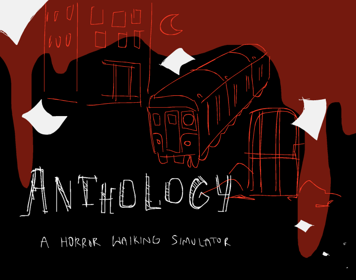
Anthology - A Horror Themed Walking Simulator
This is a collaborative project by Aditya Dheer, Evie Cundy, and Nick Dell’Aquilo created using Unity.
In the first stage of the game, the player explores a city at night. They have to collect all of the pages to progress to the second stage. Included is a stamina bar, which is affected by the player running and sprinting, and collectibles that are represented by the pages they must collect.
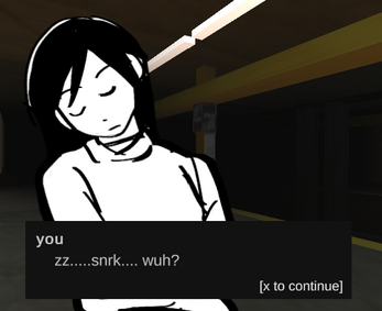
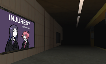
The second stage follows someone who fell asleep while waiting for their train and wakes up in an unfamiliar subway station and must retrieve their things before they escape. For this level, we experimented a lot with colliders and triggers for environmental changes, as well as programmed in a way to display interactive dialogue on the screen when the user interacts with certain areas of the level as well as interactive objects with animations. There is also a brief stint of dialogue resembling that of a visual novel.
The third level has the player navigate a darkly lit dungeon. Like the first level, they have to collect pages to progress and beat the game. This utilizes the collectible code from before as well as the stamina bar and UI from level 1. We have also included a credits stage that can be accessed through the title screen, and a win screen that can allow you to quit or replay the game from the beginning.
| Status | Prototype |
| Platforms | HTML5, Windows |
| Authors | Nick Dell'Aquilo, ec3938, Aditya_Dheer |


Comments
Log in with itch.io to leave a comment.
The dialogue and story in this game was really well done, and the graphics really compliment that. The way the pages are sometimes one of the few sources of light really works with the horror aesthetic. The controls could definitely be improved though. They dont seem to update correctly with where the camera is facing, leading to WASD going weird directions.
I really liked how the game utilized dialogue boxes to communicate. I thought the horror angle was pretty unique and that the enviromental design was really fantastic. I like how the lighting was designed - the way you made it difficult to see too far and forced the player to rely on their flashlight was great. Overall, I think you guys did a really good job.
I like how you tried something different for this exercise. The horror aspect is unique in terms of what others did, and the art assets are well-made. There are a few things I would change in terms of gameplay and camera shakiness but it this is great work! (Kaya)
The horror theme was definitely done well with the dialogue system and the assets. I thought some of the art were very well drawn and looked amazing. One thing that could have been improved slightly were the controls, which were a bit hard to use.
I like the dialogue system. The idea of using shake of camera to imitate walking is a good idea but this still needs improvement.The control of movement sometimes will be inversed and I don't know if this is a bug. Overall, the game created a horrorible enviroment. Good game!
Ok this game has fantastic vibes and I love the visual novel style character art and dialogue. The only problem is that the camera would rotate horizontally?? Like I was doing barrel rolls with my eyes.
Loved the overall feel and storyline! All the details were very well implemented and it felt very Slender-esque. The camerawork was a small thing that I would improve, as it was tough to adjust with the controls.
You did a great job on the aesthetics of the game. Excellent storyline (and dialogues) as well. I like how different tools are used in each part of the game; like having a light for the outdoors, and art pieces clues for the indoors. Took me a while to get all the clues but overall it was really neat.
Well done making a horror game. I really like the overall aesthetic that the game gives off (eerie vibes). One thing you excelled at would be the storytelling and the overall art of the game. I would say, the one thing that bothers me the most would be the sensitivity of the camera movement. It could be very shaky at times.
I love the idea of making a horror game with a sort of story for this prompt and I think the execution was really well done. I love the artwork done for the signs and the character portraits. I feel as though the camera could use a rotation lock in order to stop the camera from bobbing as much as it does.
I really like the aesthetic of the game and how the game is set to give off the dark/eerie feel. The mouse sensitivity seems to be a bit high for me, and the view seem to rotate a lot, which makes it kind of hard to navigate.
I like the horror style that this game was going for, as well as the inclusion of dialogue. The environment was also really well implemented, to the point where I was too scared of the third level because I noticed a bar and thought something was gonna chase me before I realized that it was the stamina bar and already exitted ;-;One small issue was the head bobbing thing would make the controls a little awkward at times.
The horror aesthetic is done quite well in this game. I really liked level 2 with the dialogue system (also very cool how the train hits you at the end of the level). However, I think the camera + controls could be improved.
I really like environment and all the art and assets, especially in level 2! The storytelling with the text and dialogue was really well done. The camera and controls are a little wonky but it does add a nice touch to the game. Maybe it's because the player movements are relative to the global axis rather than the player's local axis.